Dashboard - Copy this React, Mui Component to your project
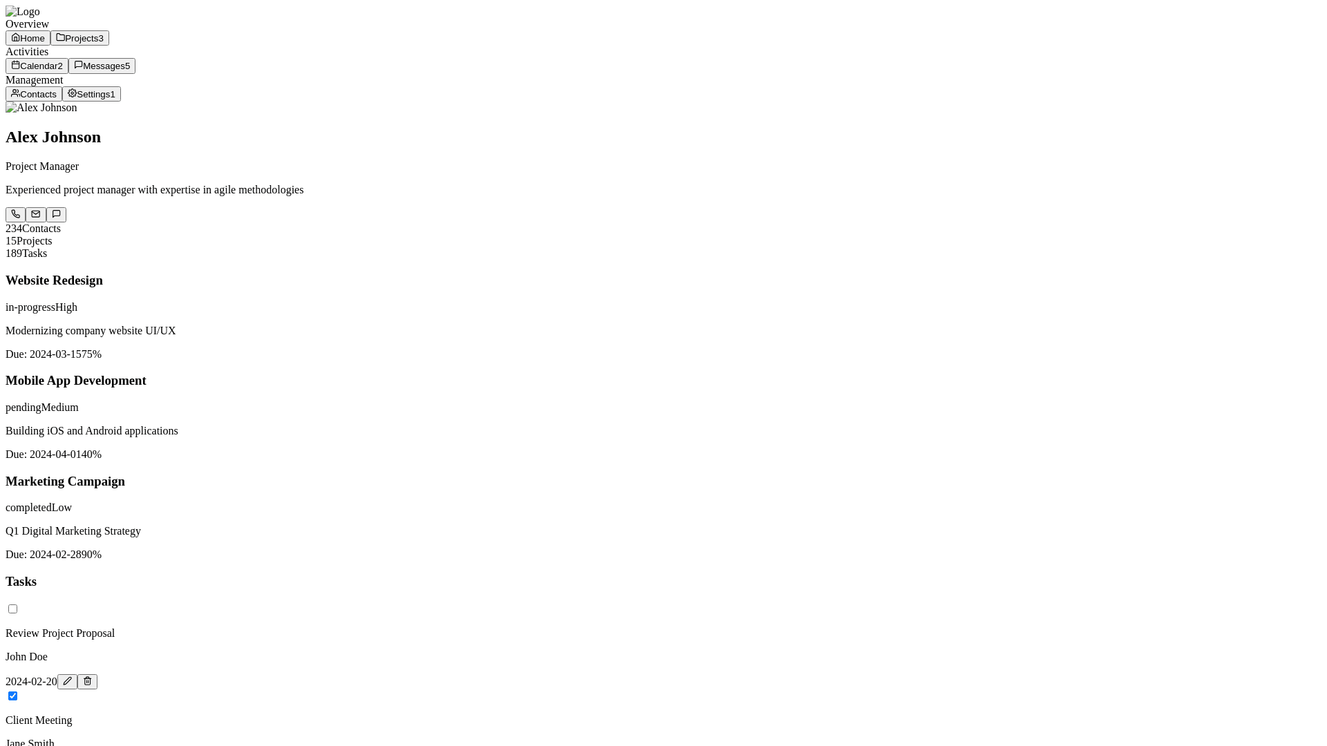
the layout appears clean and well-structured, but there are some improvements that can make it more user-friendly and efficient. Here's a revised idea to make the design more functional and visually appealing: 1. Profile Overview: Profile Picture and Contact Information: The profile picture is already clear, but making it larger or with a subtle border will enhance visual clarity. For the contact icons, ensure that the Call, Email, Message, and Add Event icons are well-spaced and easy to tap on, especially for mobile views. Add tooltips on hover (for web) to provide more details when users hover over icons. Example: "Click to send an email" for the email icon. Consider displaying a status indicator (online/offline) next to the profile picture, useful for team collaboration apps. 2. Tabs Section: Reorganize Tabs for Better Categorization: Group similar tabs together for better organization: Overview | Projects (Grouped for general status and project progress) Activities | Tasks (Group for task management and activities) Notes | Messages | Opportunities (Group for communication and collaborative information) Timeline | Meeting | Business Info (Group for planning and business-related activities) Add icon labels for each tab to make it clear and easy to navigate. For example: Overview: Icon of a document or dashboard. Projects: Project icon or bar chart. Messages: Chat bubble icon with unread badge (like the "3 unread" in the image). 3. Project and Task Management (Cards): Project Cards: Use progress bars to show completion, which you already have, but make them more visually engaging: Add percentage numbers next to or inside the progress bar. Use distinct colors for each project (e.g., blue for ongoing, green for completed, yellow for at-risk). Add hover effects on cards to show more details about the project, like deadlines, assigned team members, or specific next steps. Label each project with its status (e.g., "In Progress", "Completed", or "Delayed"). Task Management: Display tasks directly on the dashboard with clear labels and completion status. Include a "due date" tag on each task, if applicable, to allow users to see upcoming deadlines. A "priority" label (e.g., high, medium, low) on tasks can also be helpful. 4. Messaging and Notes Section: Messages Tab: Provide a message preview below the tab, showing snippets of unread messages. Allow the unread message count to be dynamically updated. The red notification badge is helpful here, but it could also include quick action options (e.g., "Mark as Read"). Notes Section: Display notes in a list format, with each note showing its last update time. Allow for search and filter within notes for quick reference. Consider adding a note summary to help users see key points at a glance (e.g., "Meeting notes from January 25th" or "Project update summary"). 5. Actionable Floating Button (FAB): Floating Action Button (FAB): Include a floating action button at the bottom-right corner (as shown in your image) to allow users to quickly create a new task, note, message, or project. The button could have a plus sign (+), and when clicked, a modal can appear where users can choose what to add. 6. Cleaner Visual Design: Color Scheme: Use a consistent color palette with primary colors (e.g., blue for active items, green for completed tasks, red for urgent tasks). Use subtle gradients for progress bars, making the design more modern and visually appealing. Typography: Use bold headings for each section and subtle text for descriptions. This will help users differentiate between categories and specific tasks. Spacing and Margins: Ensure that there is enough white space between each section and card, so the interface does not feel crowded. Also, make sure each section has a distinct border or background for clear separation. Icons and Buttons: Icons should be visually consistent and easy to recognize. Ensure that buttons (like Add Event or Add Task) are appropriately sized and visually separated from other elements for better accessibility. Example Structure of the Design: Profile Overview: Profile Picture (Clickable for Edit) Call Icon | Email Icon | Message Icon | Add Event Icon Name: John Doe Title: Senior Software Engineer Location: San Francisco, CA Tabs Section: Overview | Projects | Activities | Tasks | Notes | Messages (3 unread) Opportunities | Timeline | Meeting | Business Info Project Cards: Project Alpha (75% Progress) Progress Bar: Blue Project Beta (45% Progress) Progress Bar: Orange Project Gamma (90% Progress) Progress Bar: Green Floating Action Button (FAB): Add Task | Event | Message | Note Final Thoughts: These updates will make the layout not only more visually appealing but also more functional and user-friendly. The addition of icons, dynamic progress bars, searchable notes, and a floating action button will significantly improve the overall user experience. The clean and modern interface will help users stay organized, prioritize tasks, and communicate effectively. You said: see the image rewrite content : . Profile Overview: Profile Picture and Contact Information: The profile picture is already clear, but making it larger or with a subtle border will enhance visual clarity. For the contact icons, ensure that the Call, Email, Message, and Add Event icons are well-spaced and easy to tap on, especially for mobile views. Add tooltips on hover (for web) to provide more details when users hover over icons. Example: "Click to send an email" for the email icon. Consider displaying a status indicator (online/offline) next to the profile picture, useful for team collaboration apps. 2. Tabs Section: Reorganize Tabs for Better Categorization: Group similar tabs together for better organization: Overview | Projects (Grouped for general status and project progress) Activities | Tasks (Group for task management and activities) Notes | Messages | Opportunities (Group for communication and collaborative information) Timeline | Meeting | Business Info (Group for planning and business-related activities) Add icon labels for each tab to make it clear and easy to navigate. For example: Overview: Icon of a document or dashboard. Projects: Project icon or bar chart. Messages: Chat bubble icon with unread badge (like the "3 unread" in the image). 3. Project and Task Management (Cards): Project Cards: Use progress bars to show completion, which you already have, but make them more visually engaging: Add percentage numbers next to or inside the progress bar. Use distinct colors for each project (e.g., blue for ongoing, green for completed, yellow for at-risk). Add hover effects on cards to show more details about the project, like deadlines, assigned team members, or specific next steps. Label each project with its status (e.g., "In Progress", "Completed", or "Delayed"). Task Management: Display tasks directly on the dashboard with clear labels and completion status. Include a "due date" tag on each task, if applicable, to allow users to see upcoming deadlines. A "priority" label (e.g., high, medium, low) on tasks can also be helpful. 4. Messaging and Notes Section: Messages Tab: Provide a message preview below the tab, showing snippets of unread messages. Allow the unread message count to be dynamically updated. The red notification badge is helpful here, but it could also include quick action options (e.g., "Mark as Read"). Notes Section: Display notes in a list format, with each note showing its last update time. Allow for search and filter within notes for quick reference. Consider adding a note summary to help users see key points at a glance (e.g., "Meeting notes from January 25th" or "Project update summary"). 5. Actionable Floating Button (FAB): Floating Action Button (FAB): Include a floating action button at the bottom-right corner (as shown in your image) to allow users to quickly create a new task, note, message, or project. The button could have a plus sign (+), and when clicked, a modal can appear where users can choose what to add. 6. Cleaner Visual Design: Color Scheme: Use a consistent color palette with primary colors (e.g., blue for active items, green for completed tasks, red for urgent tasks). Use subtle gradients for progress bars, making the design more modern and visually appealing. Typography: Use bold headings for each section and subtle text for descriptions. This will help users differentiate between categories and specific tasks. Spacing and Margins: Ensure that there is enough white space between each section and card, so the interface does not feel crowded. Also, make sure each section has a distinct border or background for clear separation. Icons and Buttons: Icons should be visually consistent and easy to recognize. Ensure that buttons (like Add Event or Add Task) are appropriately sized and visually separated from other elements for better accessibility. Example Structure of the Design: Profile Overview: Profile Picture (Clickable for Edit) Call Icon | Email Icon | Message Icon | Add Event Icon Name: John Doe Title: Senior Software Engineer Location: San Francisco, CA Tabs Section: Overview | Projects | Activities | Tasks | Notes | Messages (3 unread) Opportunities | Timeline | Meeting | Business Info Project Cards: Project Alpha (75% Progress) Progress Bar: Blue Project Beta (45% Progress) Progress Bar: Orange Project Gamma (90% Progress) Progress Bar: Green Floating Action Button (FAB): Add Task | Event | Message | Note Final Thoughts: These updates will make the layout not only more visually appealing but also more functional and user-friendly. The addition of icons, dynamic progress bars, searchable notes, and a floating action button will significantly improve the overall user experience. The clean and modern interface will help users stay organized, prioritize tasks, and communicate effectively. ChatGPT said: ChatGPT Based on the image you shared, here's a refined and detailed update to the profile and project management design, focusing on visual clarity, functionality, and improved user interaction: