Styled Paper - Copy this React, Mui Component to your project
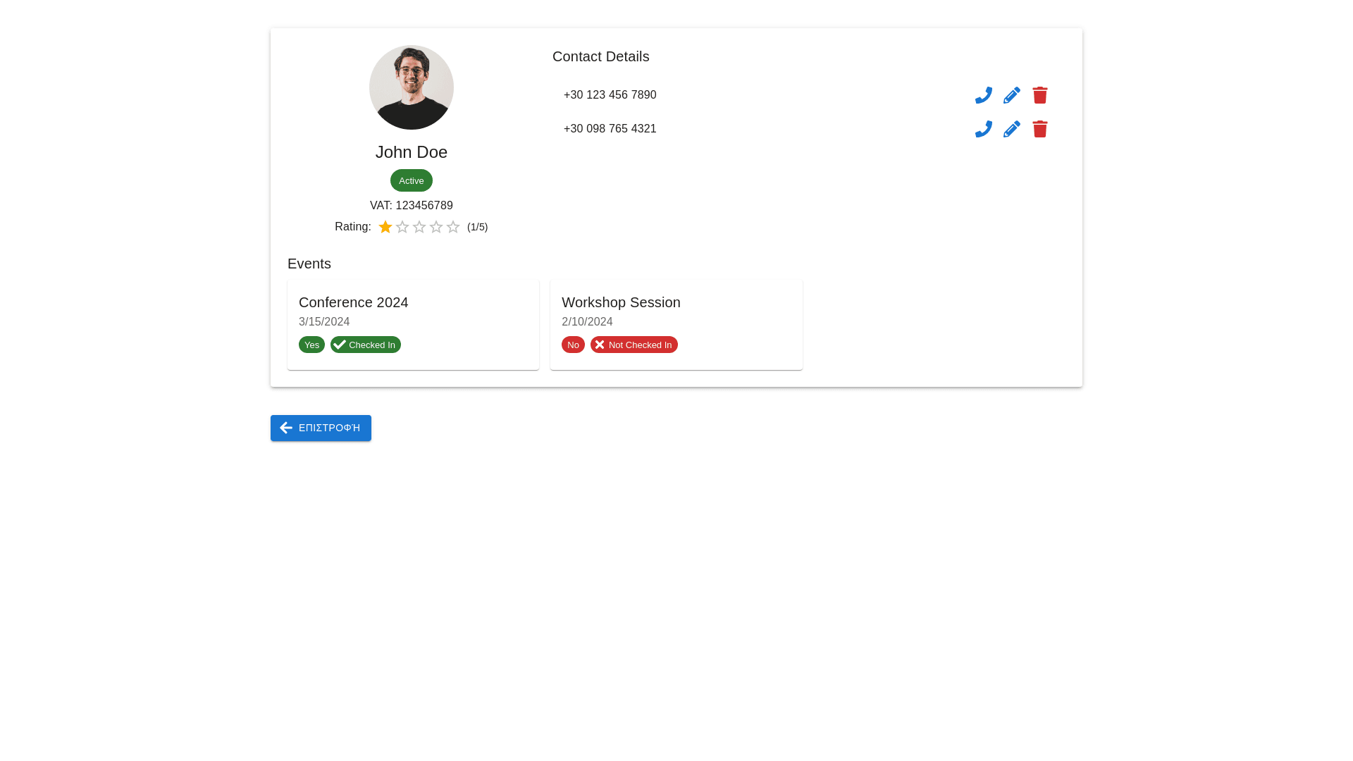
General Layout Header Section: Display user profile details, including a profile icon, name, and status (e.g., "Active"). Show a unique identifier (e.g., VAT number). Include a rating system with a score (e.g., "1 / 5") and a star based rating. Contact Details Section: Display a list of contact numbers with associated actions (e.g., call, edit, delete). Each contact should have multiple interaction options, such as: Call: A button/icon to initiate a phone call. Edit: A button/icon to edit the contact details. Delete: A button/icon to remove the contact. Contact numbers should be listed vertically for clarity. Event Management Section: Assigned Events: Display a list of events the user has been assigned to. For each event, show the user’s response status: Yes: User accepted the invitation. No: User declined the invitation. None: User has not responded. Check in Status: Indicate whether the user has checked into the event. Use clear icons or text for check in status (e.g., a green check for checked in or a red cross for not checked in). Sort the events by date, and group them into upcoming and past events for easier navigation. Action Button: Provide a return button (e.g., "Επιστροφή") for navigation purposes. Functional Requirements User Profile Management: Ability to view, edit, and display user related information like VAT and rating. Status indicators (e.g., Active/Inactive) to denote the user account's current state. Contact Management: List and manage multiple phone numbers for a user. Provide interactive options (call, edit, delete) for each contact. Event Management: Fetch and display assigned events for the user. Record and display user responses (Yes/No/None) to event invitations. Track and display whether the user has checked into the event. Ratings System: Implement a visual rating system with stars and numerical values. Ratings should be read only in some scenarios. Responsive Design: Ensure the layout adapts well to different screen sizes and devices. Action Oriented UI: Clear and intuitive placement of action buttons for each contact. Return button to navigate back without confusion. Design Specifications Typography: Use bold text for labels (e.g., "Α.Φ.Μ:", "Βαθμολογία", "Events"). Use standard font sizes for data display. Spacing and Alignment: Align data points and action buttons properly for readability. Separate sections with adequate spacing for clarity. Iconography: Use universally recognizable icons for actions (e.g., phone for calling, pencil for edit, trash for delete). Use event specific icons for statuses (e.g., calendar for events, checkmark for check in, question mark for no response). Theme and Colors: Ensure a clean and minimal design, emphasizing readability and usability. Use contrasting colors for different statuses (e.g., green for "Yes", red for "No", gray for "None").