Blog Posts - Copy this React, Tailwind Component to your project
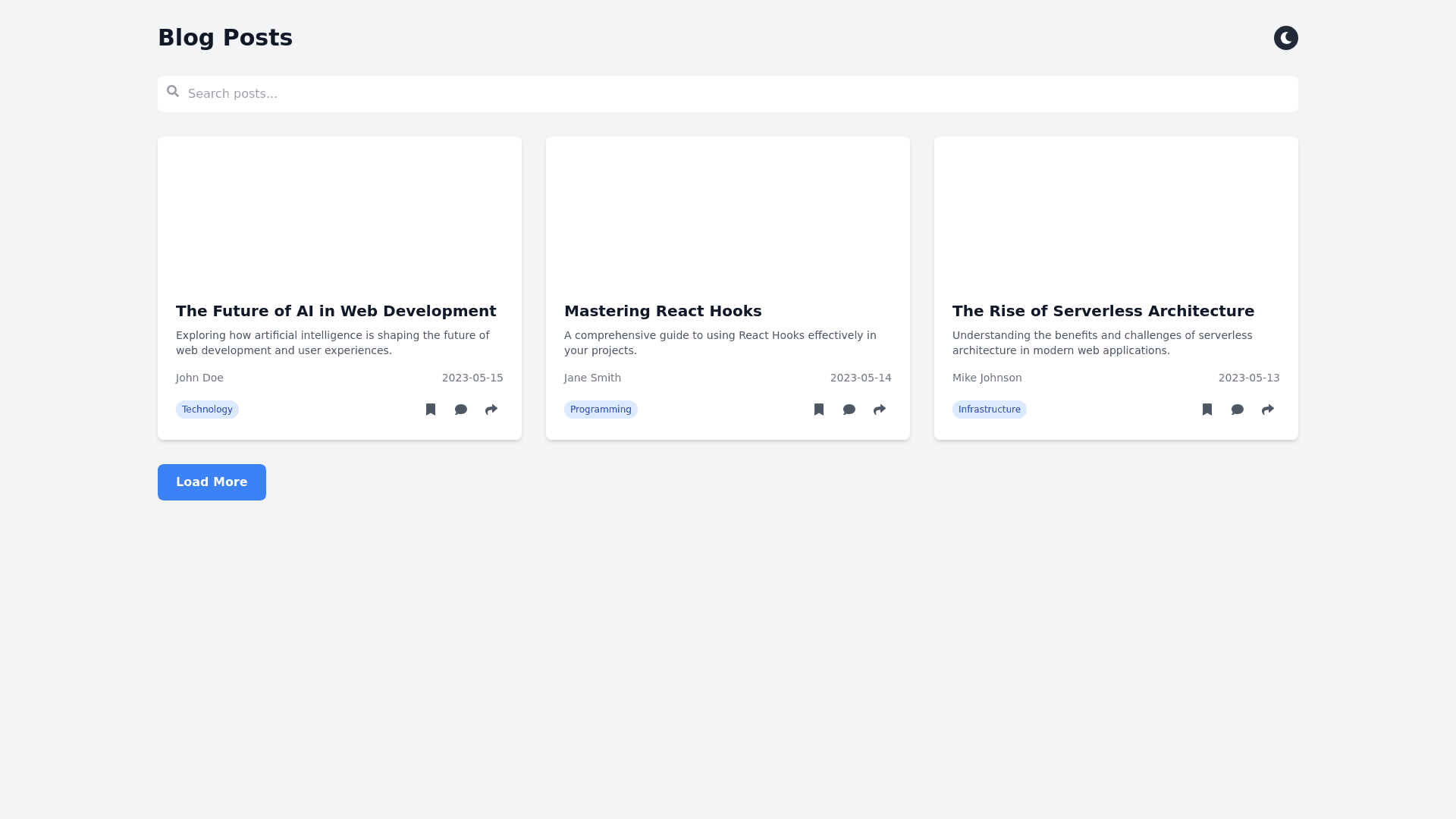
Create a component that displays a vertical list of posts. At the top of each post, the author's name and circular profile picture appear on the left, followed by the title of the post. The title of the post is bold, large, and prominent, immediately followed by a brief summary in a smaller, lighter font. Below that, the post metadata shows the publication date, the number of views and comments, and a like count, all displayed in a small, secondary text. To the right of the metadata, action icons for bookmarking, commenting, and sharing are neatly aligned in a row. The posts component include a small thumbnail image on the right, which aligns with the text, providing a visual preview. The posts are separated by thin horizontal lines with generous spacing to ensure readability. The container holding the list has padding on all sides, ensuring content doesn't touch the edges, and the layout is responsive, adjusting to single column on smaller screens, where images, if present, stack above the text. The design uses bold fonts for titles, lighter styles for metadata, and simple, consistent icons for interactions like likes and shares. The color scheme favors a grayish background, with brighter colors for titles and muted tones for metadata, ensuring the content is the primary focus.
