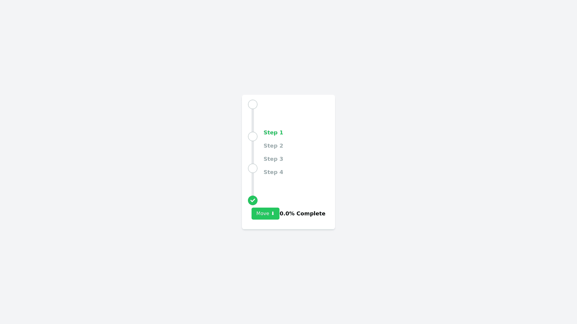
Vertical Progress Bar - Copy this React, Tailwind Component to your project
Import * as React from "react"; import { Box, makeStyles, Typography, withStyles, createStyles, Theme, Button } from "@material ui/core"; import clsx from "clsx"; const barHeight = 250; const useStyles = makeStyles((theme: Theme) => createStyles({ root: { display: "flex", height: `${barHeight}px`, justifyContent: "center", position: "relative", width: "20px" }, progressContainer: { backgroundColor: theme.palette.grey[200], height: "100%", position: "relative", width: "0.1rem" }, progressBar: { backgroundColor: theme.palette.common.black, position: "absolute", top: 0, transition: "height 150ms", width: "0.1rem", zIndex: 1 }, stepsContainer: { display: "flex", flexDirection: "column", height: "100%", justifyContent: "space between", position: "absolute" }, step: { alignItems: "flex end", display: "flex", position: "relative", zIndex: 2 }, stepCircle: { height: "1rem", width: "1rem" }, animateComplete: { animation: "$growShrink .3s ease" }, "@keyframes growShrink": { "0%": { transform: "scale(1)" }, "50%": { transform: "scale(1.2)" }, "100%": { transform: "scale(1)" } } }) ); const StepLabel = withStyles((theme: Theme) => createStyles({ root: { fontWeight: theme.typography.fontWeightBold } }) )(Typography); export const Step: React.FC<{ complete: boolean; label: string; }> = ({ complete, label }) => { const classes = useStyles(); const completeIcon = ( <img className={clsx(classes.stepCircle, { [classes.animateComplete]: complete })} src={"black circle.png"} alt="completed step" /> ); const incompleteIcon = ( <img className={clsx(classes.stepCircle, { [classes.animateComplete]: complete })} src={"white circle.png"} alt="incomplete step" /> ); return ( <Box className={classes.step}> {complete ? completeIcon : incompleteIcon} <span style={{ left: 32, minWidth: "10rem", position: "absolute", top: 2 }} > <StepLabel variant="body2">{label}</StepLabel> </span> </Box> ); }; interface Props { percent?: number; steps?: { label: string; }[]; } const stepList = [ { label: "Business Details" }, { label: "Payment Information" }, { label: "Customer Service" } ]; const ProgressStepper: React.FC<Props> = ({ percent = 0, steps = stepList }) => { const [percentage, setPercentage] = React.useState(percent); const progressBarHeight = Math.floor(barHeight * (percentage / 100)); function getSafePercent(percent: number) { return Math.min(100, Math.max(percent, 0)); } function getStepPosition(steps: number, stepIndex: number) { return (100 / (steps 1)) * stepIndex; } function getStepComplete( currPercent: number, currStepIdx: number, totalSteps: number ): boolean { const position = getStepPosition(totalSteps, currStepIdx); const safePercent = getSafePercent(currPercent); return position <= safePercent; } console.log("hello"); const classes = useStyles(); return ( <Box flexDirection="column"> <Box mb={2}> <Button onClick={() => setPercentage(16.7 * 3)} variant="contained" color="primary" > Move <span role="img"> ⬇️</span> </Button> <Box component="span" ml={3}> {percentage}% complete </Box> </Box> <Box className={classes.root} role="progressbar"> <Box className={classes.progressContainer}> <Box className={classes.progressBar} style={{ height: Math.min(barHeight, progressBarHeight) }} /> </Box> <Box className={classes.stepsContainer}> {steps.map((step, i, allSteps) => ( <Step key={step.label} complete={getStepComplete(percentage, i, allSteps.length)} label={step.label} /> ))} </Box> </Box> </Box> ); }; export default ProgressStepper; make this vertical progress bar but green and add four steps, dont use material ui or anything