Video Review Section - Copy this React, Tailwind Component to your project
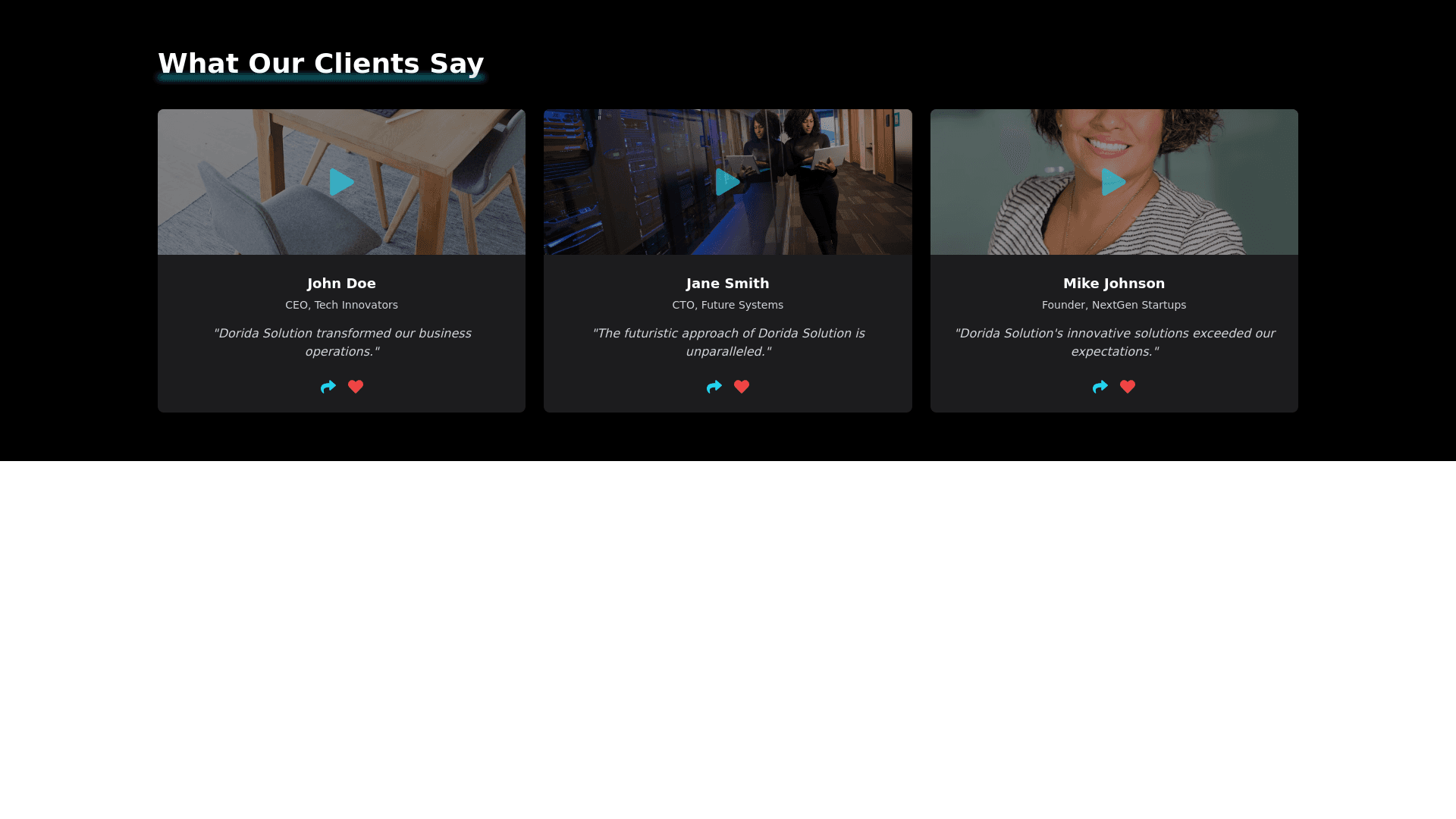
Create a frontend section for a web app showcasing video reviews for "Dorida Solution." The design should embody a modern, elegant, and futuristic aesthetic, emphasizing dark backgrounds, vivid neon accents, and a clean, minimalistic layout. Below are the specifics: 1. General Section Structure: Main Background: Utilize a pure black background (#000000) for the entire section to establish a sleek and sophisticated ambiance. Section Title: Display the title "What Our Clients Say" at the top. Use a large, bold, sans serif font in white (#FFFFFF), centered horizontally. Add a subtle neon blue underline effect (#00FFFF) that glows softly, enhancing the futuristic feel. Provide ample spacing (30 40px) below the title before the video grid begins. 2. Video Review Cards Design: Each card represents a client video review, designed with clarity and futuristic elements in mind. Card Background: Use a dark slate gray (#1C1C1E) with slightly rounded corners (10px radius). The card should subtly stand out from the main background without being too contrasting. Card Layout: Desktop: Arrange cards in a 3 column grid. Tablet: Switch to a 2 column grid. Mobile: Use a single column layout. Maintain consistent spacing (20px) between cards to prevent overcrowding. Video Thumbnail: Display at the top of each card. Use a still frame from the video with a dark overlay (rgba(0, 0, 0, 0.4)) to indicate that it's playable. Overlay a neon play icon (#00FFFF) centered on the thumbnail, with a subtle pulsating glow to draw attention. Client Name and Title: Below the thumbnail, display the client's name in bold white text (#FFFFFF), using a sans serif font at 18px. Include their title or company in light gray (#D3D3D3), 14px font, italicized for distinction. Center both lines of text and provide 10px spacing below the thumbnail. Review Excerpt: Add a brief excerpt (1 2 lines) from the review below the client's name. Use light gray text (#D3D3D3), 14px font, possibly in quotes. Ensure the text is centered and has adequate line spacing for readability. 3. Interactive Elements: Each card will feature interactive components to enhance user engagement. Play Button (Over Thumbnail): The play icon on the thumbnail acts as a button. Hover Effect: On hover (or tap on mobile), the overlay lightens slightly (rgba(0, 0, 0, 0.2)), and the play icon's glow intensifies. Action: Clicking plays the video in a modal overlay or expands the card to play the video inline, maintaining the dark theme with neon blue controls. Share and Like Buttons: Positioned at the bottom of the card. Share Button: Icon: A minimalist share symbol in neon blue (#00FFFF). Hover Effect: Icon scales up slightly with a brighter glow. Action: Opens sharing options (e.g., social media, copy link). Like Button: