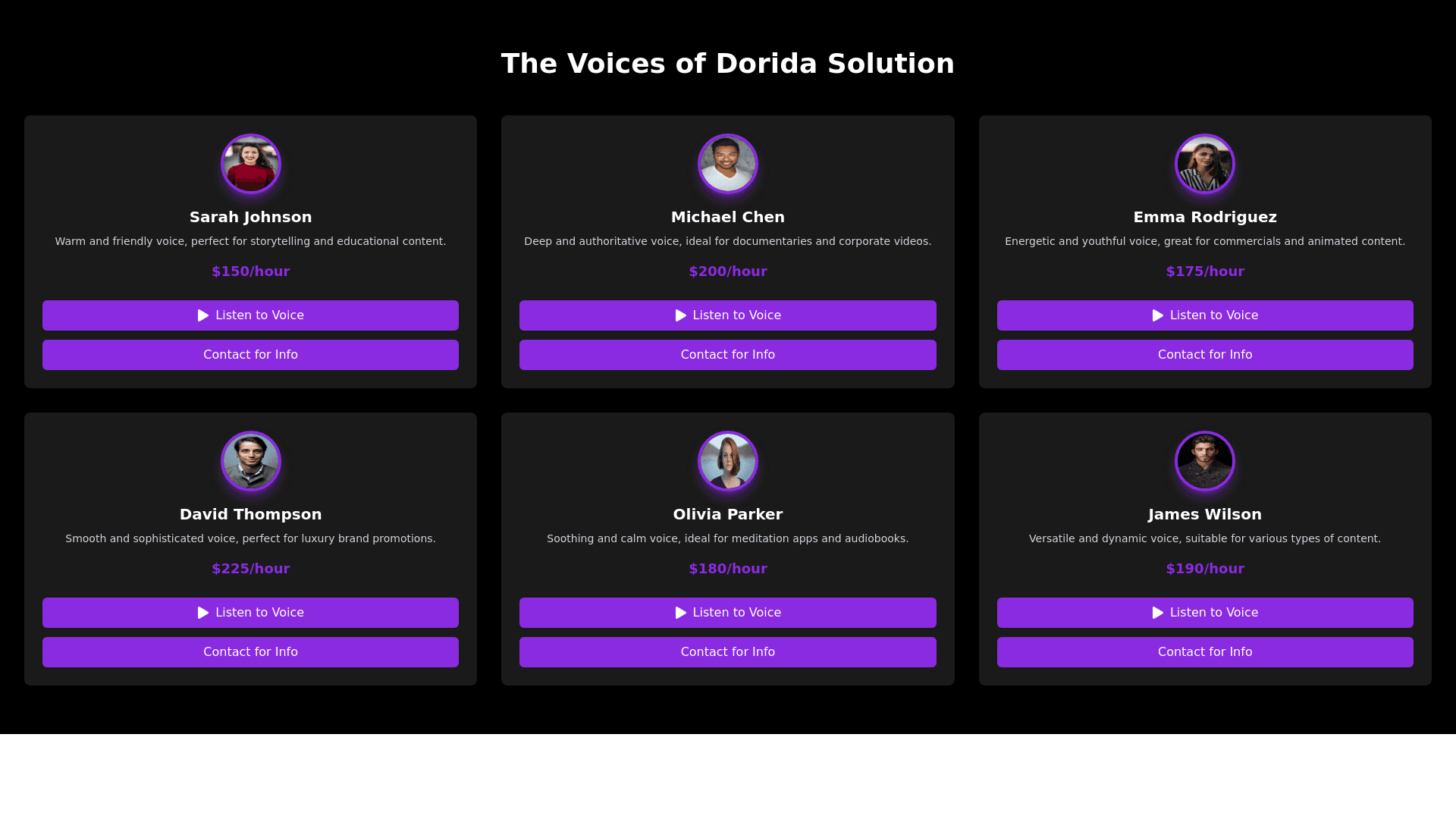
Voice Narrator Section - Copy this React, Tailwind Component to your project
Create a frontend section for a web app showcasing a collection of voice narrators for "Dorida Solution." The design should follow a modern, elegant, and futuristic style, with a focus on dark backgrounds, vibrant neon highlights, and a minimalistic layout. Here are the details: 1. General Section Structure: Main background: Use a pure black (#000000) background for the entire section, creating a sleek, sophisticated look. Section title: At the top, display the title "The Voices of Dorida Solution" in large, bold, sans serif font, white (#FFFFFF) in color, and centered on the page. Ensure there's enough space (30 40px) below the title before starting the grid of voice cards. 2. Voice Cards Design: Each card represents an available narrator and follows a clean, futuristic design: Card background: Use dark charcoal black (#1A1A1A) with slightly rounded corners (8px radius). The background should be darker than the section but lighter than the main background to subtly distinguish it. Card layout: On desktop, cards should be 200x300px, arranged in a 3 column grid. For tablets, use 2 columns, and on mobile, switch to a single column. Maintain a 20px margin between cards to avoid crowding. Narrator image: At the top of each card, display a circular avatar (80x80px) of the narrator. Add a neon purple border (#8A2BE2) with a soft glow effect for a futuristic feel. Center the image within the card. Narrator name: Directly below the image, add the narrator's name in bold white (#FFFFFF) text, using a sans serif font, sized at 18px. Ensure the name is centered and spaced 10px below the avatar. Voice description: Follow the name with a short description (2 3 lines) about the voice's tone or style. This should be light gray (#D3D3D3) and in a 14px font, positioned centrally. Price: Display the price at the bottom of the card in neon purple (#8A2BE2), slightly larger than the description text (16px, bold). Place it either centrally or aligned to the right to make it stand out. 3. Interactive Buttons: Each card will have two interactive buttons: Listen button: Background: Neon purple (#8A2BE2). Text: "Listen to the Voice" in white (#FFFFFF), centered inside the button. Shape: Rectangular with rounded edges (6px radius). Hover effect: On hover, the button will enlarge slightly and the purple will brighten (e.g., to #B57EDC), with a soft glow effect. Action: Clicking the button opens a minimalist audio player in the card, keeping the dark theme with purple controls. Purchase/Contact button: Background: Same neon purple as the "Listen" button. Text: "Purchase" or "Contact for Info" in white. Design and hover effect identical to the "Listen" button. 4. Responsiveness: Ensure the section is fully responsive: Desktop: Display a 3 column grid. Tablet: Switch to 2 columns. Mobile: Use a single column layout, with touch friendly buttons and adequate spacing to prevent accidental taps.
