Header - Copy this React, Tailwind Component to your project
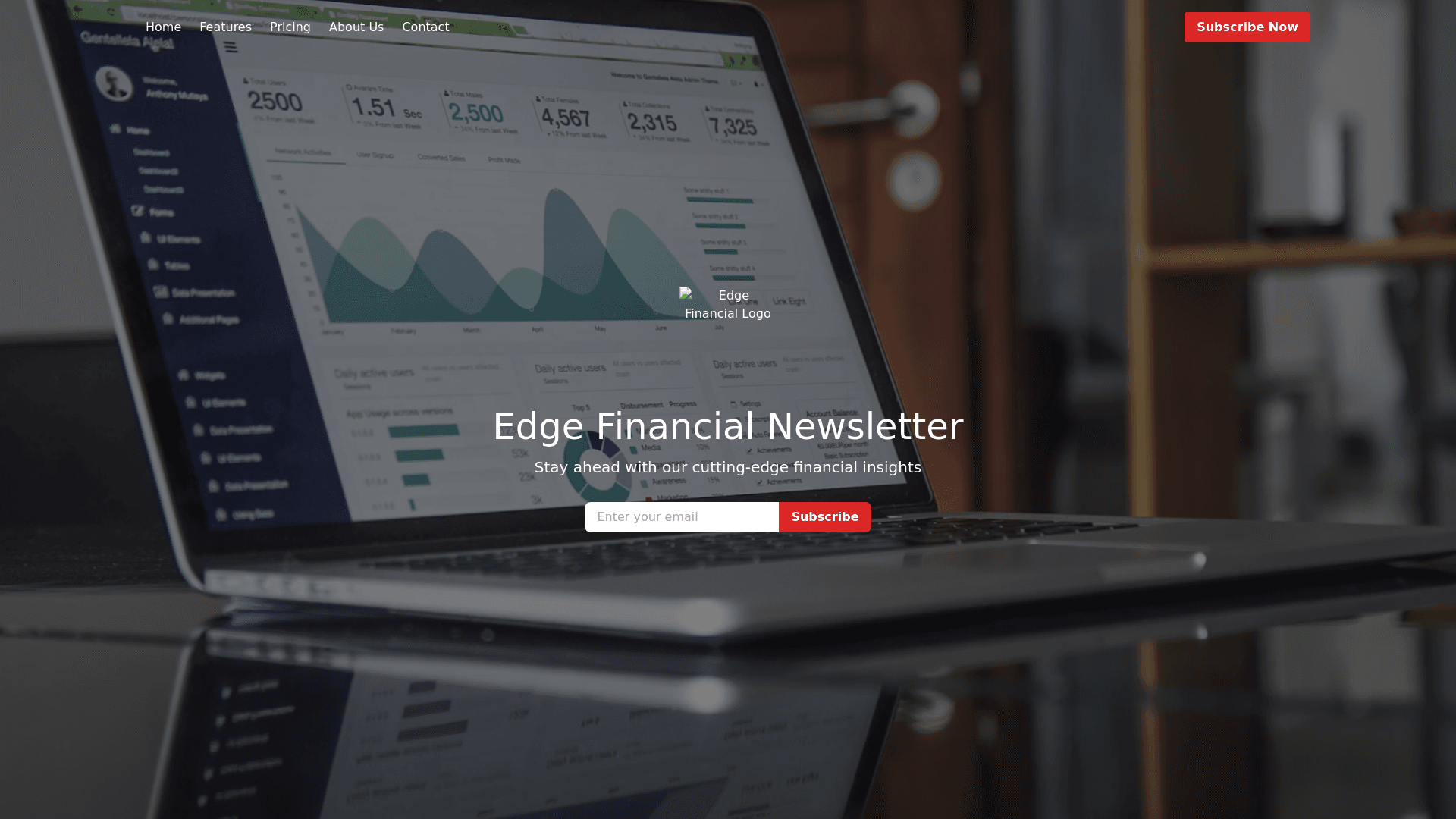
Thought for 12 seconds Components of the Website Layout for the Edge Financial Newsletter Service 1. Header Component Description: A fixed header that remains at the top of the page during scrolling. Features a minimalist navigation menu with thin typography. Navigation Links: Home Features Pricing About Us Contact On the right side, a subtle yet noticeable call to action button labeled "Subscribe Now." Design Details: Background Color: Navy Blue Text Color: White Typography: Thin, minimalist font for a modern look. Layout: Uses flexbox to align items horizontally and justify content between navigation links and the call to action button. Technical Implementation: Built as a React functional component. Styled using Tailwind CSS classes. Example Tailwind classes: flex, justify between, items center, p 4, bg navy blue, text white Conditional Rendering: Can highlight the active page link based on the current route. 2. Hero Section Component Description: A full width hero image depicting financial markets or stock charts. Overlaid with the company's logo and name in bold, oversized typography. A smaller tagline beneath the company name, e.g., "Stay Ahead of the Market with Expert Insights." A prominent subscribe field for newsletter sign ups: Email input field "Subscribe" button Design Details: Image: High resolution image related to finance. Overlay: Semi transparent dark layer to enhance text readability. Text Color: White or light color for contrast. Alignment: Content is centrally aligned both vertically and horizontally. Subscribe Field: Input and button styled for prominence. Button uses red to stand out. Technical Implementation: React component with a background image set via CSS. Uses Tailwind CSS for styling: bg cover, bg center, text center, py 20 Conditional Rendering: May display different hero content based on user interactions or time of day. Responsive Design: Ensures the hero section looks great on all devices. 3. Introduction/Features Section Component Description: A two column layout beneath the hero section. Left Column: Large, bold heading like "Unlock Your Investment Potential." Paragraph text introducing the newsletter's value proposition. Right Column: Grid layout displaying key statistics or achievements. Four grid items using object mapping for efficient rendering. Design Details: Left Column: Text Alignment: Left aligned. Text Color: Navy Blue or Black on a white background. Right Column: Statistics Grid: Displays items such as: "10,000+"<br>Subscribers "Daily"<br>Market Analyses "Expert"<br>Contributors "95%"<br>Subscriber Satisfaction Emphasis: Bold numbers or titles in red for emphasis. Descriptions: In navy blue or black text. Spacing: Ample whitespace for an uncluttered look. Technical Implementation: Uses React with flexbox or grid for layout: grid, grid cols 2, gap 8 Object Mapping: Maps over an array of statistics to render grid items. Tailwind CSS for styling and responsiveness. 4. Testimonials/Statistics Section Component Description: A section with a dark background showcasing testimonials or impressive statistics. Uses bold, white typography for contrast. May include rotating testimonials. Design Details: Background Color: Dark Navy or Black. Text Color: White. Content Alignment: Centrally aligned. Typography: Bold fonts for impact. Technical Implementation: React component styled with Tailwind CSS: bg dark navy, text white, text center, py 16 Conditional Rendering: Uses state to display different testimonials. May implement a carousel using libraries like react slick. Performance Optimization: Loads only necessary content to enhance performance. 5. Footer Component Description: Located at the bottom of the page. Contains: Navigation links Social media icons Contact details Maintains the minimalist style of the site. Design Details: Background Color: Navy Blue. Text Color: White. Typography: Smaller font size for secondary information. Layout: Organized into columns or centered content. Technical Implementation: React component using semantic <footer> tag. Styled with Tailwind CSS: bg navy blue, text white, text sm, py 8 May use flexbox or grid for content arrangement.