Modern Style Guide - Copy this Html, Bootstrap Component to your project
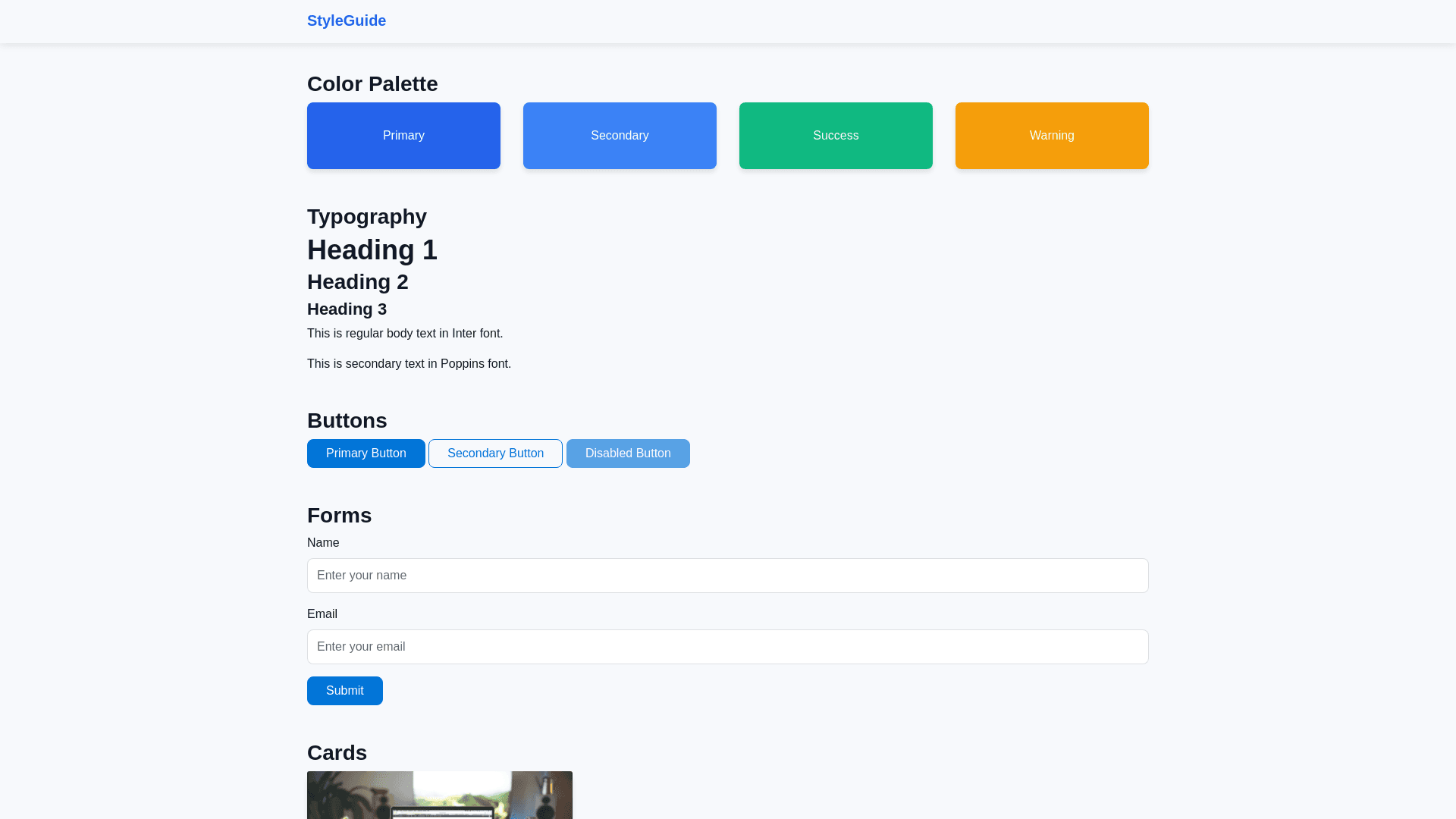
Creating a comprehensive website style guide ensures that your website maintains a cohesive design and user experience. Below is a detailed style prompt to guide the design and development process for your website: Website Style Guide 1. General Theme Primary Theme: Blue, comfortable on the eyes ("مريح للعين"), ensuring readability and a calm aesthetic. Mode Support: Light mode and dark mode with a smooth toggle button. Light Mode Icon: Moon Dark Mode Icon: Sun Loading Animations: Include stylish yet lightweight loading animations to enhance user experience. 2. Color Palette Primary Colors: Light Mode: Background: #f7f9fc Primary: #2563eb Secondary: #3b82f6 Text: #111827 Dark Mode: Background: #1e293b Primary: #60a5fa Secondary: #93c5fd Text: #f3f4f6 Accent Colors: Success: #10b981 Warning: #f59e0b Danger: #ef4444 Shadows and Highlights: Subtle box shadows for depth, such as rgba(0, 0, 0, 0.1) for light mode and rgba(0, 0, 0, 0.5) for dark mode. 3. Typography Font Family: Primary: "Inter", sans serif Secondary (Headings): "Poppins", sans serif Font Sizes: Body Text: 16px Headings: Responsive with clamp() for adaptability (H1: 36px, H2: 28px, H3: 22px) Font Weight: Regular: 400 Bold: 700 4. Layout Grid System: Responsive, based on flexbox or CSS grid. Spacing: Use a consistent scale, e.g., 4px, 8px, 16px, 32px. Breakpoints: Mobile: max width: 640px Tablet: max width: 768px Desktop: min width: 1024px 5. Buttons Style: Primary: Rounded, solid background with hover effects (scale(1.05) and slight color change). Secondary: Outlined with 2px border and hover effect (solid fill with fade). States: Hover: Lighter/darker shade depending on mode. Disabled: Greyed out with cursor: not allowed. 6. Animations GSAP Integration: Animations for navigation menus (e.g., slide in effect). Scroll based animations for content reveal. Smooth Scrolling: Apply for anchor links. 7. Navigation Style: Responsive navbar with dropdown for mobile. Animated underline on hover. Position: Sticky at the top with a background that changes on scroll (box shadow for contrast). 8. Forms Input Fields: Rounded edges, subtle shadows, and focus outline (2px solid primary color). Buttons: Matched to primary/secondary button styles. Validation: Inline validation with clear error messages (red text). 9. Cards Style: Rounded edges, box shadows, and hover effects (lift and glow). Content aligned with padding of 16px. Content: Include a header, image, and footer section. 10. Footer Style: Dark background with contrasting text. Sections: Quick Links Contact Information Social Media Icons with hover animations. 11. Icons Source: Use a consistent icon library like FontAwesome or Heroicons. Style: Inline with text or buttons, matching the color scheme. 12. Responsiveness Approach: Mobile first design. Features: Collapsible menus for smaller screens. Optimized images and SVGs. 13. Interactivity Hover Effects: Subtle animations on interactive elements. Feedback: Toast notifications for actions like form submission, using libraries like Toastify.js. 14. Extras Favicon: Custom designed logo that matches the theme. SEO: Optimize meta tags and include social media previews. Accessibility: Ensure color contrast meets WCAG standards and ARIA roles are defined for assistive technologies.