Whiteboard - Copy this React, Tailwind Component to your project
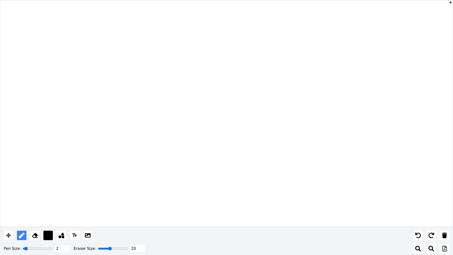
Project Overview: Develop a fully functional whiteboard component for an online training platform using React. The whiteboard should be responsive and occupy 100% width of its container. Below the whiteboard, include a comprehensive tools panel with various icons and buttons for user interaction. Whiteboard Functionalities: Whiteboard Canvas: Full width, responsive canvas for drawing and writing. Tools Panel: Move Icon/Button: Enables selection, resizing, and moving of drawn objects. Pen Tool: Round tip drawing tool. Adjustable pen size via slider and numeric input. Options for different pens: Marker (70% transparency). Ink pen with various tip styles (square, tilted line). Eraser Tool: Adjustable eraser size with a slider and numeric input. Two shapes available: round and square. Color Picker: Opens a color panel; user can select colors to add to a palette. Applies selected color to current drawing tools and shapes. Shape Tool: Click to open a popup with shape options (line, rectangle, oval, triangle, star). Allows user to draw selected shapes on the canvas. Text Tool: Click to add text; double click on the canvas to edit text. Image Upload: Button to upload images from the user’s computer. Undo/Redo Buttons: Manage activity history (up to 10 steps). Clear Button: Clears the entire whiteboard. Zoom Tools: Zoom In: Changes cursor to a magnifying lens (+); click to zoom in on a selected area. Zoom Out: Changes cursor to a magnifying lens ( ); click to zoom out. Background Options: Paper Icon: Opens a menu to select background patterns (grid, lined paper). Paper Size Icon: Input fields for custom dimensions (height, width) and a dropdown for standard sizes (A4, A3). Add New Page: Button to add a new page/canvas. Navigation arrows to switch between pages. Selection Tool: Allows users to select and manipulate drawn objects (text, shapes, images). Selected objects can be deleted using the delete button or the eraser. User Interaction: Users can modify colors of shapes and text using the color picker. Editable text should be resizable and movable, with handles appearing when selected. Clicking outside or pressing the Escape key will deselect any selected objects. Design Requirements: Ensure the entire component is responsive for different screen sizes. Maintain a clean and intuitive user interface for easy interaction.